1 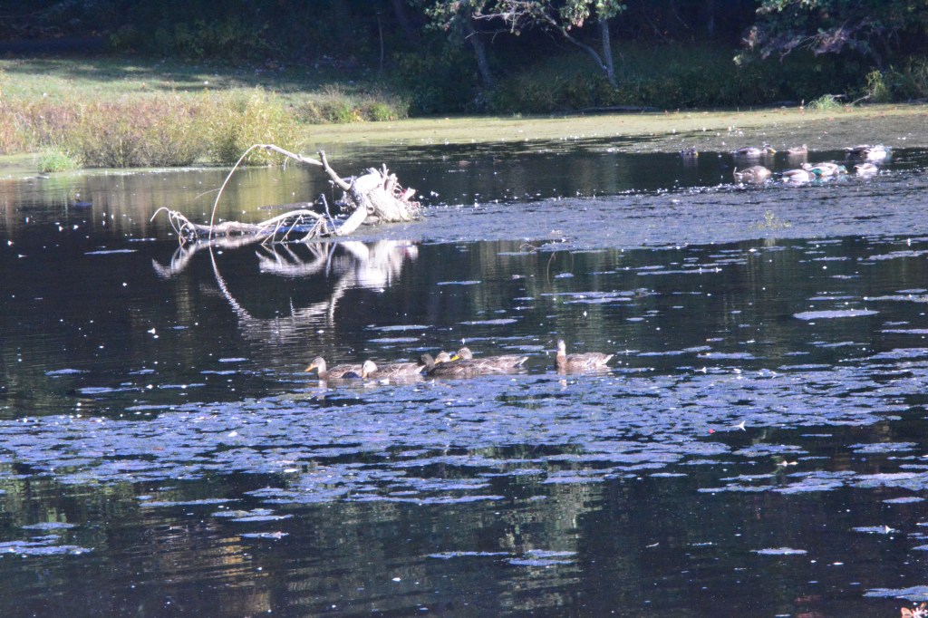
2 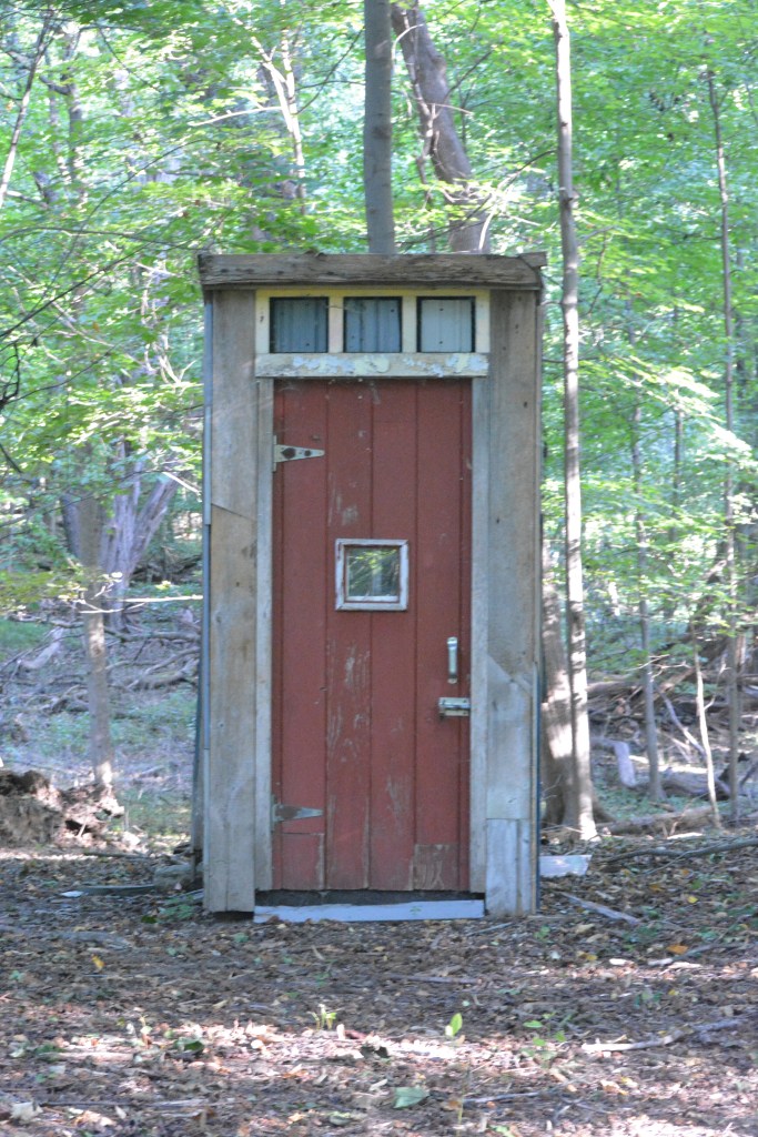
3 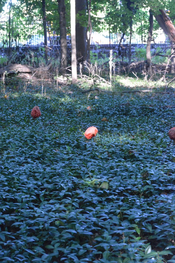
4 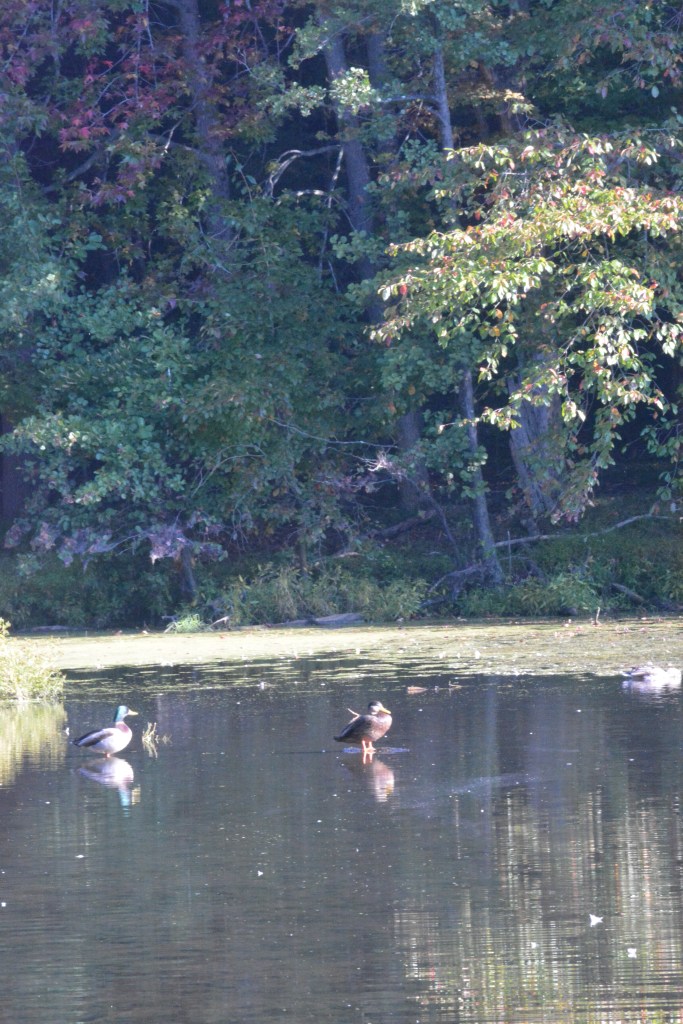
5 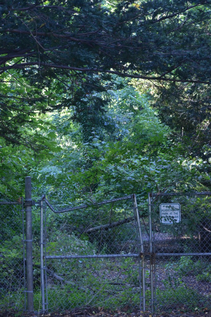
6 
7
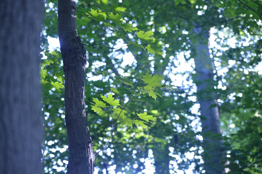
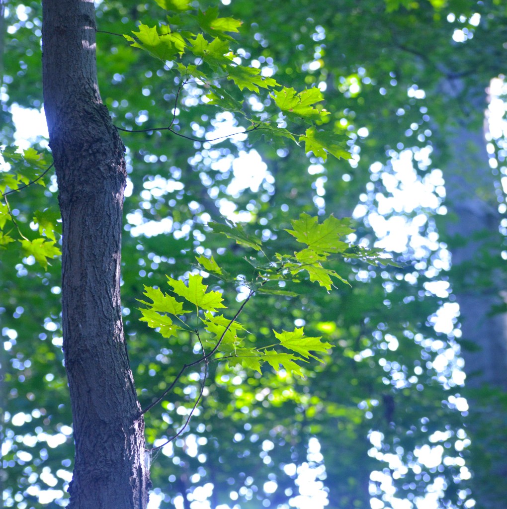
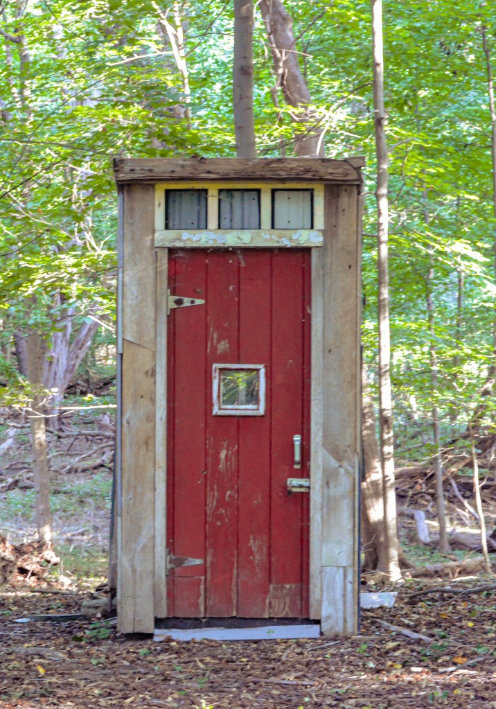
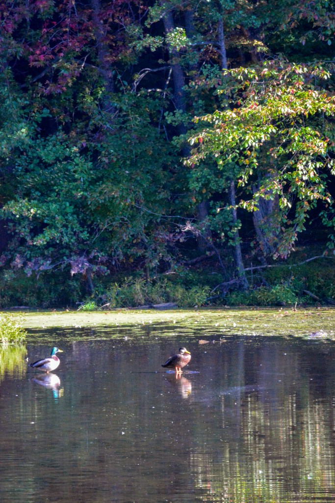
For photos 1 and 2 I followed a tutorial called “Creating Visual Impact on a Camouflaged Subject.” I chose this because these particular photos had a lot going on in them, with the same colors all across the board, making it hard to focus in on the aspect of the picture like I wanted. I had to tweak a few extra things since the photos were very different from each other and also the photo used as an example, but across the board only small adjustments were made. I brightened the shadows and added saturation to the subject’s color using the color mix, and added texture and clarity. I cropped the photos more closely so it wasn’t so distracting, and used vignettes to draw your eye where I wanted it to be.
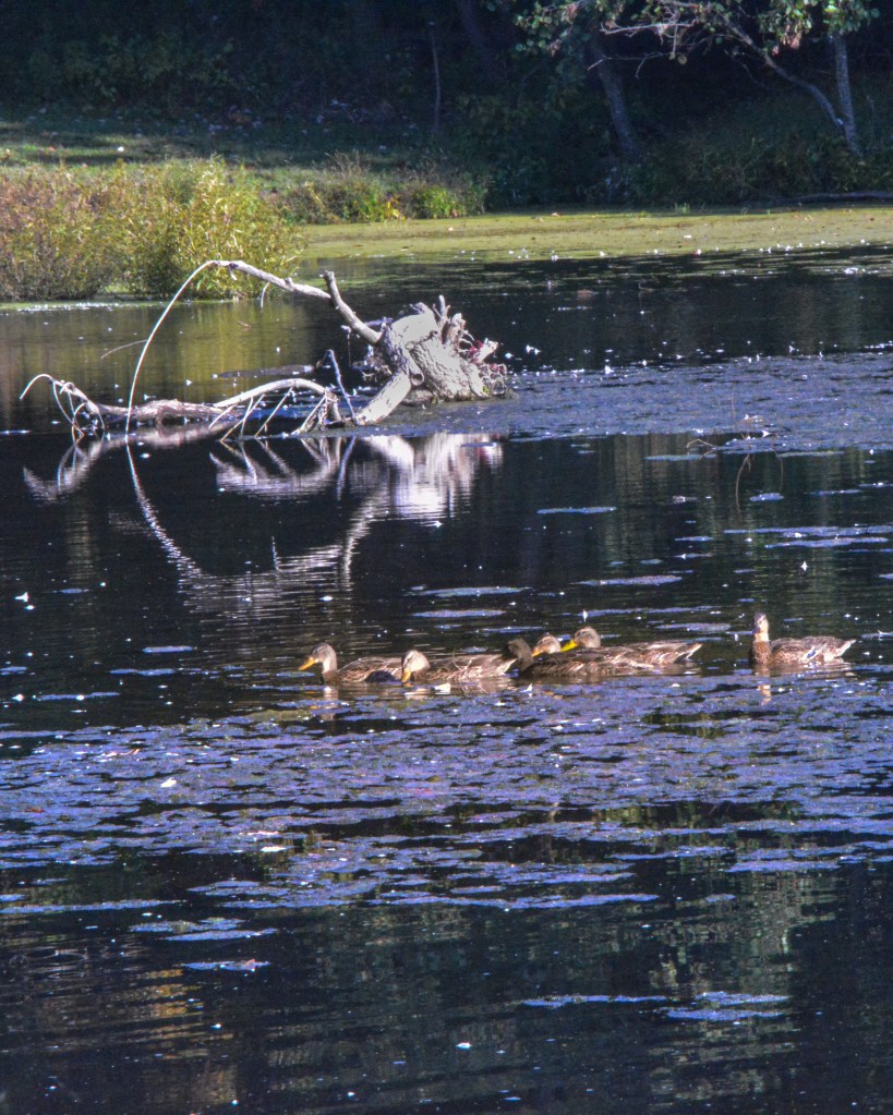
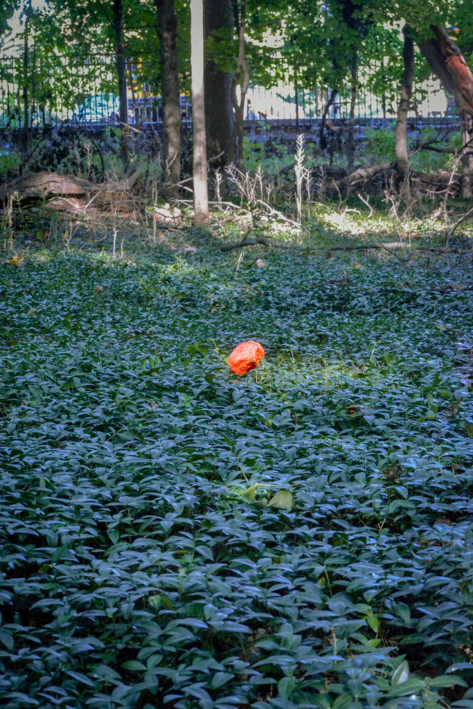
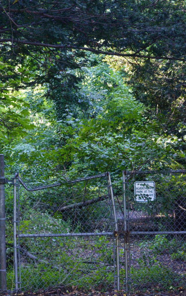
I used “Enhancing Complimentary Colors for Impact” for photos 3 and 4, since they both had bright red subjects against green/brown backgrounds. I had some trouble with the third photo, it’s a little blurry so making edits without adding too much noise was really hard, so I don’t really like how it turned out, but the tutorial still brought out the red like I wanted. For both photos I brought up the contrast and shadows, while bringing down the highlights and blacks. To make the color pop I used the color mixer and some point curve, along with some texture and clarity (more on photo 3) and some warmth and radial edits (more on photo 4).
For photo 5 I used the “Balancing Light and Color in a Landscape” tutorial, since the lighting in this photo wasn’t the best, and neither was the color. This tutorial was very natural, and he made it clear he doesn’t like over saturated, over edited photos, which I thought worked well with this picture. I followed the tutorial by boosting the contrast and shadows and whites, and lowering the highlights and blacks, and also by using the color mixer. I then did a little extra fixing to de haze the photo and add a little extra texture.
For the last two photos, I didn’t follow any tutorials, but I tried to edit them keeping in mind all of the tutorials I had previously watched. I kept in mind balancing my color and light, how to keep focus on my subject, and boosting saturation without it being too much. I used radial edits to boost bland backgrounds and just tried to use everything I had learned in other photos.
